Do you ever go through the clothes in your closet like I do and say, “This goes. This stays. I’ve had this since high school!”
It’s really fun when your favorite high school sweater is back in style! And, as you know, letter jackets NEVER go out of style.
Have you had some of your window treatments almost as long as that old sweater?
You might actually be lucky and discover that the draperies your grandma gave you when you moved into your first house are back IN style. Or maybe the style is back, but the color or pattern is OUT.
I thought it would be fun to take a look at some of those old styles and see if they’re in the “toss this immediately” pile or “this could work with a makeover” pile, or possibly “this is so IN again” pile.
Working in this industry for over 20 years means that I have seen A LOT of trends come and go. Roman shades, draperies and cornice boards are still popular. Swags and fun valances went out, but seem to be making a comeback. I was very happy to see that most of the window treatments I worked on over the years would still look great today, and be in style, because they’re classic looks that stand the test of time.
One of the main things that stuck out as being dated, though, was COLOR. The color of the fabrics dated them, as well as the colors on the walls of homes. If you go back twenty or more years, the most popular paint colors were yellows, especially in the mustard yellow family, and sage green. Fabrics tended to be red, gold or jewel tones.
We used a lot of tassel trims back then, whereas now we see more banded trims. But, guess what, I am starting to see tassels coming around again.
In hardware, light walnut finishes are not used much right now. Golds (believe it or not) and polished nickel metals, as well as darker wood finishes, are more prevalent.
As far as drapery styles go – tab tops, rod pockets and puddled drapes are OUT.
Let’s take a look at some examples of projects I worked on years ago and how I’d update them:
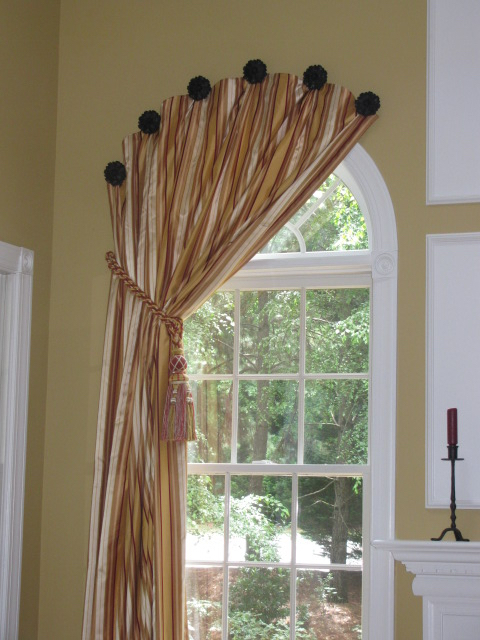
For the project below, I would update the wall color and use a linen or cotton fabric in a different pattern – and something other than gold and red. The color would be dependent upon the wall color. Neutrals, blues and greys are very popular.
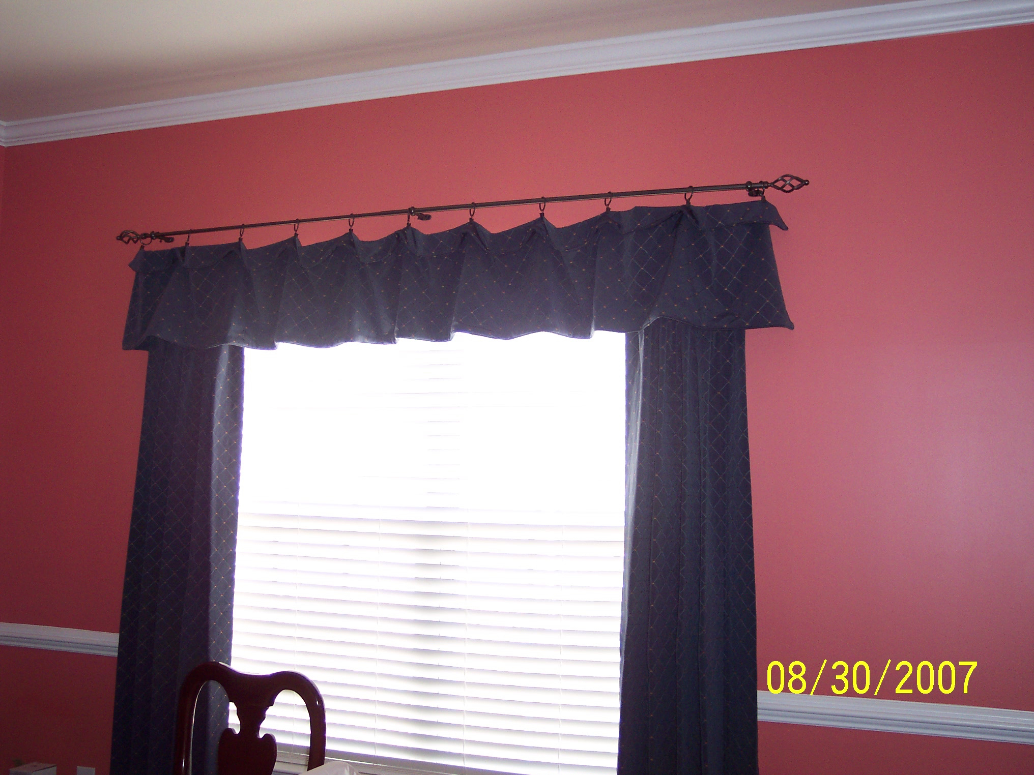
I don’t mind the fabric in this next project, as long as the wall color was updated. I would not use clip rings. I would use a fatter diameter rod, maybe raise it slightly, and make the valance slightly longer.
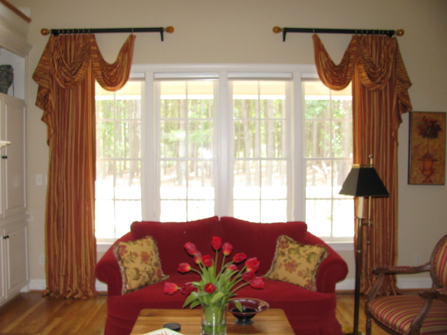
 The neutral wall color in the photo below is fine, but the gold and red colors of the fabric are outdated. And I would use a less heavy fabric than silk—probably a linen or cotton.
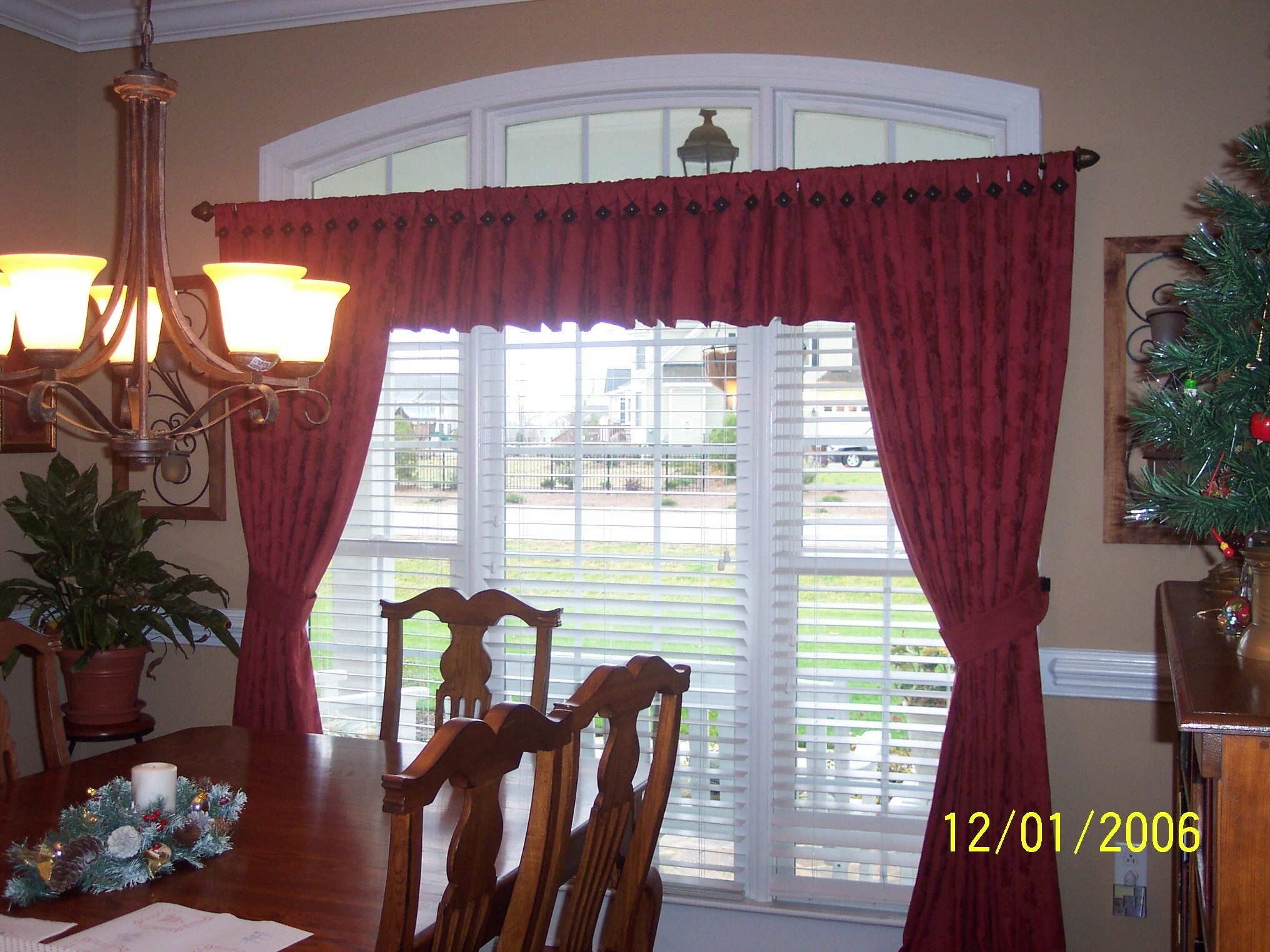
In this project, the traditional fabric is fine, but I’d install the rod above the arched transom window to make the room look taller. I’d use a nice decorative rod and finials. And I’d get rid of the valance. I would also use rings instead of the tabs you see on top. Now, the drapes would hang straight and stack further off the window onto the wall, so they wouldn’t block as much light or the view.
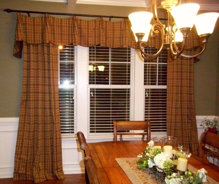
The plaid draperies in this photo look dated because of the colors and the slight puddling of the fabric on the floor. If I were doing this one today, I would recommend a different paint color for their walls–something a lot lighter, or if they preferred a dark color, I’d suggest a dark blue. I would use a fatter diameter rod and raise it slightly closer to the ceiling/beam. I’d recommend a floral fabric or a solid with a banded trim down the lead edge of the drapes, with a complimentary cording on the valance. And the drapes would hang about ¼” off the floor—no pudding allowed!
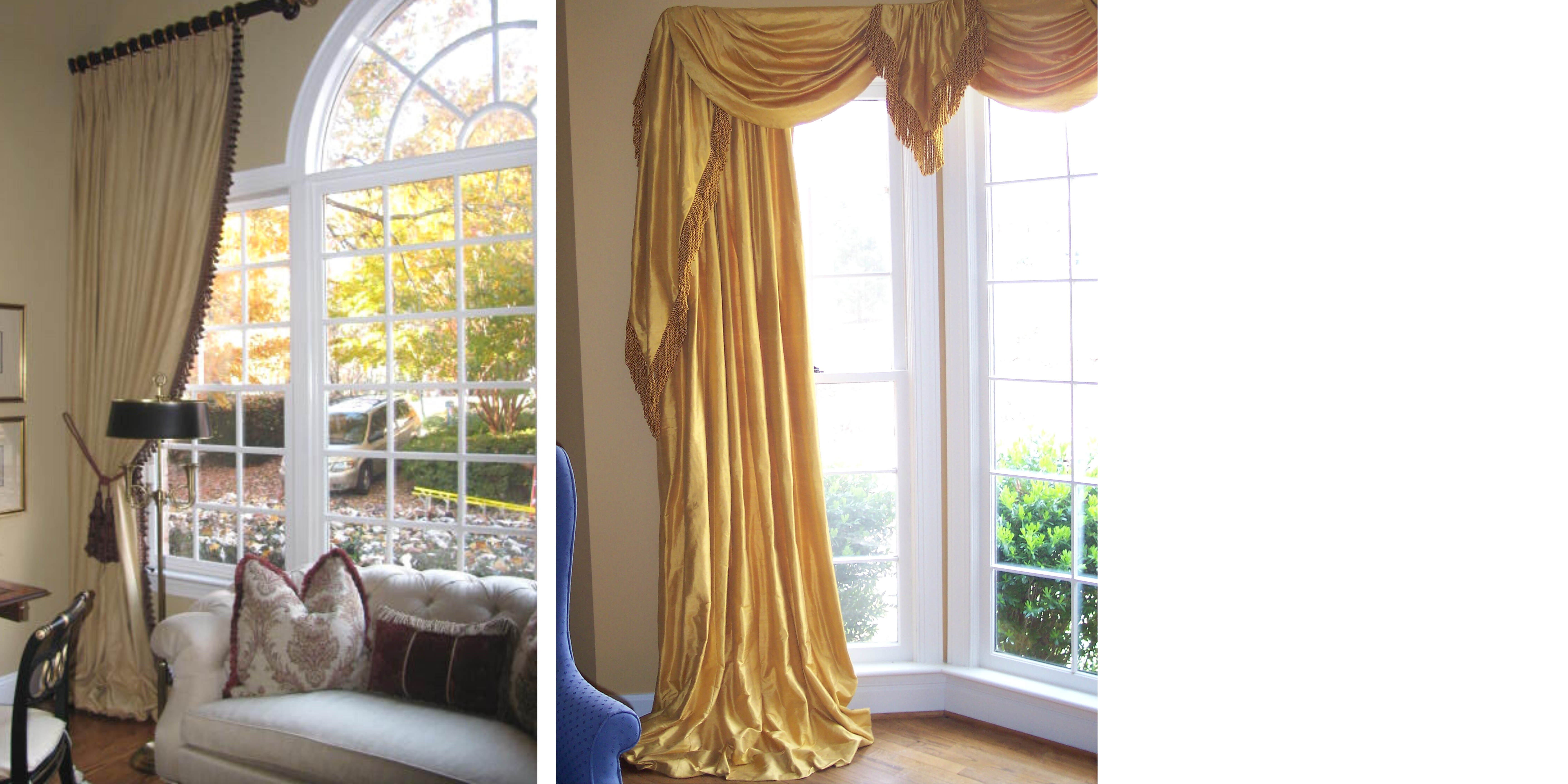
 Even though these two photos with the gold fabrics are puddled and have “dated” elements, they are still very classic and stylish.
  Finally, as I always tell my clients – it doesn’t matter what the trends are. It has to make YOU happy. Like in fashion, not all trends are for everyone. In a few years, I’m sure all the grays being used today will look dated. But, if you’ve decided it is time to give your window treatments an update, you know where to find me. I’d be happy to help.

